We could all use a redesign
On the Atlantic, and bringing a 162-year-old magazine into the digital age

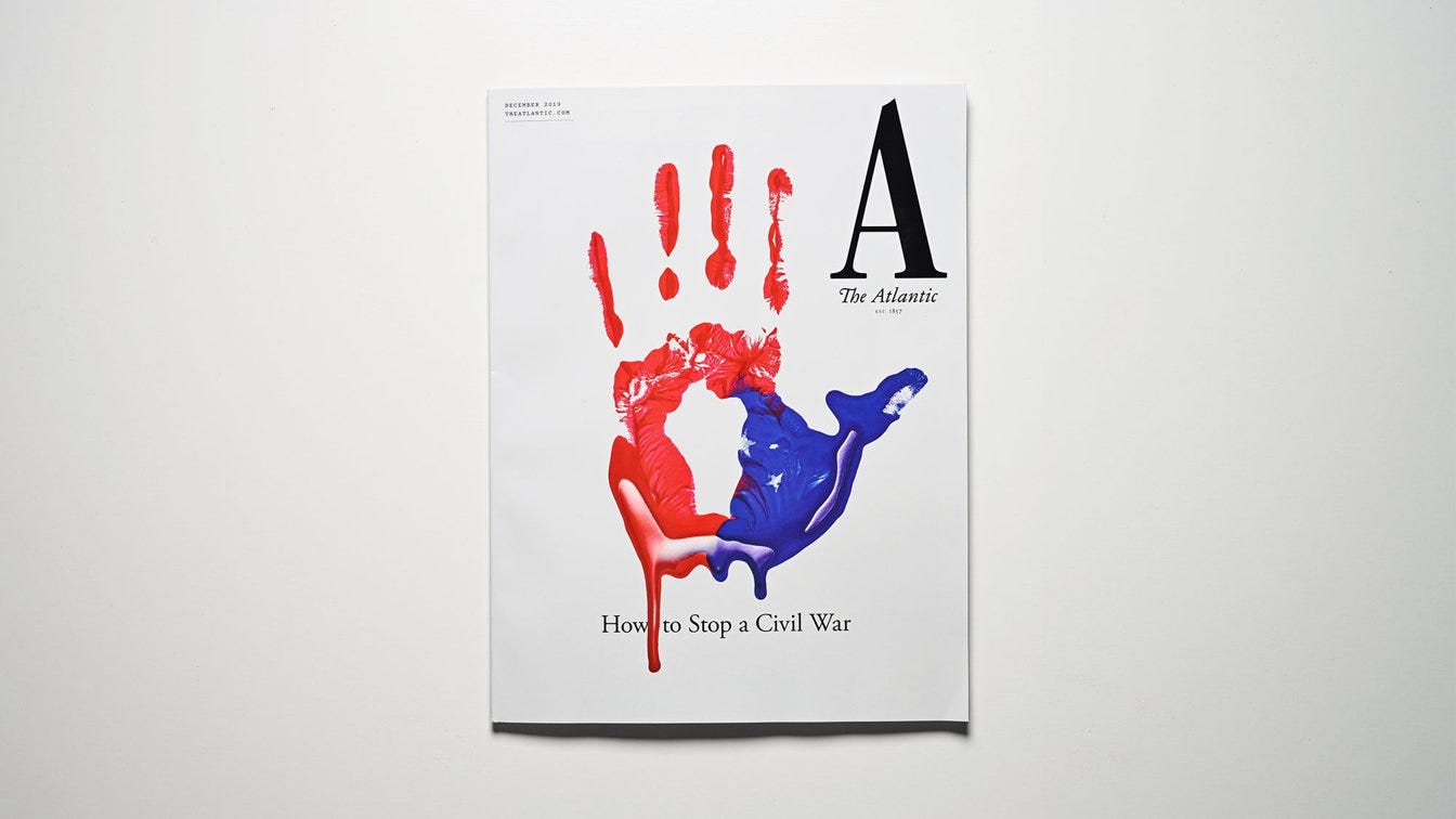
The Atlantic’s December issue is out, and readers will notice a different look. Described as “the most dramatic new look for our magazine in its 162-year history,” the magazine has a redesign not only to its print product but also its app.
Jeffrey Goldberg, The Atlantic’s editor in chief interviewed the magazine’s creative director, Peter Mendelsund, on the new design.
The most notable re-design is the nameplate, which makes the signature Atlantic “A” representative of the whole.
A big factor for all this? Digital.
“When Oliver Munday, my senior art director, and I began rethinking the wordmark, we tried a number of angles, mainly finding ways to repurpose and redraw old marks from The Atlantic’s past. But the notion occurred to us that we would eventually need a mark that wouldn’t be so horizontal; in other words, a mark that wasn’t a word, such that it could fit in all of those confined spaces where, physical magazine aside, The Atlantic lives. Like on your phone, and on your social-media feeds, etc. It seemed obvious to us that what we needed was an emblem—a logo.”

“At some point, we noticed that we had already been clicking on that very logo, every time we went to The Atlantic online, or on the app, or on Twitter—that is, a giant A. There it was, staring us in the face. And the more we explored The Atlantic’s long history, the more we saw that A, Zelig-like, showing up. Which is to say that, although the A seems radical, it is in fact historically grounded. Like The Atlantic itself.”
Even for publications with a strong print product, journalism doesn’t just exist on paper anymore. It exists on all sorts of platforms and in a lot of different ways. Standardizing that look across all of these is not only good design but it builds brand loyalty and honestly, it’s just good journalism.
// adriana lacy writes the intersection. you can follow her on twitter at @adriana_lacy //


